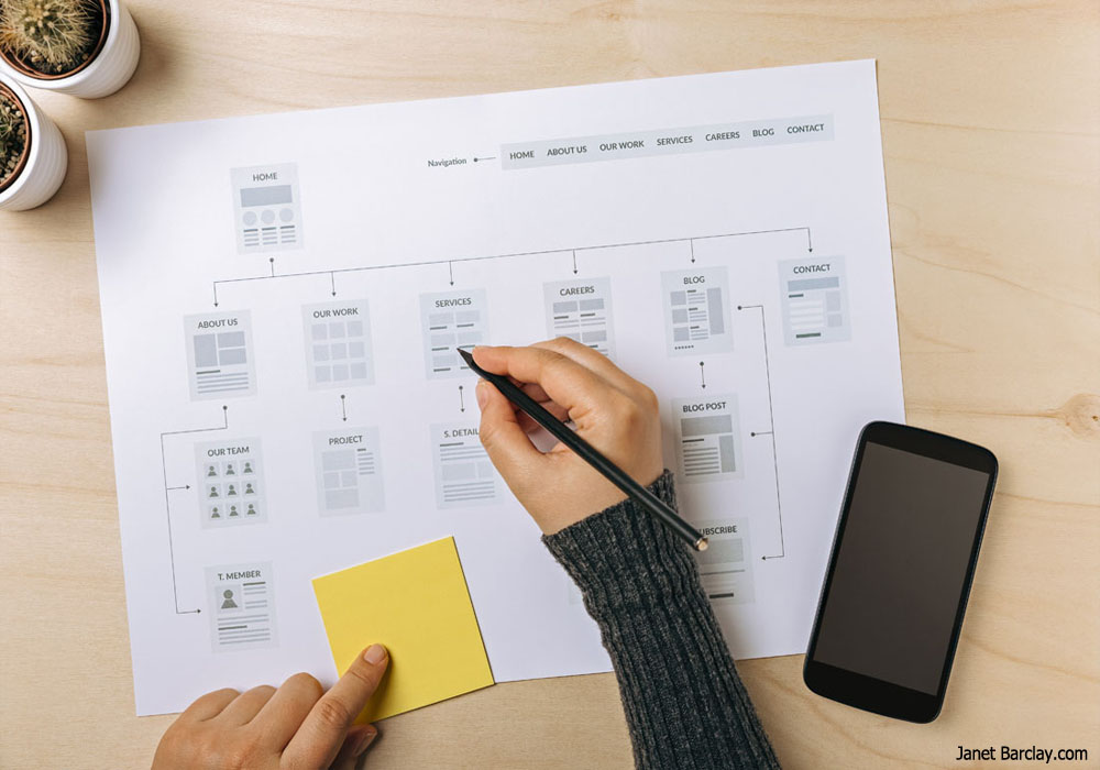
Creating the right user interface is a challenging task that demands regular testing to ensure that things are smoothly moving in the destined direction for your business. For that, it is essential for a designer to know his target audience, their desired reaction and business goals well enough.
I’m Saad Raja, a UI/UX expert, and I have formulated some guidelines to help designers create successful user interface designs for their websites.
1) Focus on your users
Understanding the target audience is the first and most important step, on which all other steps rely. You need to completely get to know your users and to keep their needs in mind constantly. For this, you will need to research everything about their demographics, what are they searching for, and what hindrances are there in between them and their goals. To make your interface user-focused, it is crucial to know more than just their desires; you need to interact with the people who will be using your websites. You cannot cater to the expectations and requirements of your users unless you do a careful analysis of their needs, opinions, feedbacks and desires.
2) Go for simplicity
It is a common opinion that users find simplicity more appealing. When they access your site, they have a particular need in mind. If your designs assist them in satiating that need quickly and easily, they are likely to be satisfied with it. For this purpose, it is crucial for designers to keep their interface as simple as possible. Some practices that can help in simplifying the interface include providing easy navigation, carefully positioning the text, adding a sitemap, and providing answers to common user questions. Adding fancy complicated features might look good in appearance, but it will confuse the users and drive them away from the site.
3) Be clear
Clarity is one of the most significant elements of a good user interface. Designers should let the users know what their sites will help them in finding, how will it let them interact with the brand, and what will be the consequences of successful use. If you are clear when designing the interface, the chances are that your users will stay confident and motivated to return to the site again.
4) Create an appropriate copy
No interface can be effective without the right copy. The content you place on the site should be directly by the needs of the users. For this purpose, you should carefully research what your audience needs, give it a creative touch and then incorporate that into your copy.
5) Inform users about the consequences
Almost all interactions that take place on a website have consequences attached with them. For example, clicking a specific button may add something to your cart, make a purchase, or make a comment etc. Informing users about the consequences of buttons before they can click on them should be an essential part of good interface design. For this, you can highlight buttons, attach symbols to them or color-code them.
6) Make good use of visuals
Designers should predict the most important parts of their website and then highlight them in a manner that user attention is drawn towards it. To achieve this effect, you can use a variety of techniques like highlighting something, changing its colors, or adding whitespace around it.
7) Make it responsive
User trends have varied significantly over the years and nowadays not keeping responsive designs in mind when creating your interface can be a huge mistake. Following responsive web design practices will make your designs compatible with a wider range of devices, and hence, provide better experiences to all your users.
8) Predict user mistakes
Since your users often tend to make a lot of mistakes, it is advisable for you to anticipate them when creating your interface so that you can provide solutions to assist them. Some common mistake-prevention tactics include keeping buttons inactive till everything is correct or pop-ups to confirm whether the user is ready to stick by the initial command. However, designers should be more careful when designing their interface so that the user satisfaction is maximized. You can allow them to restore something they have deleted, or explain to them what do they need to correct so that the ‘Submit’ button becomes active.
9) Add keyboard shortcuts
Shortcuts are preferred by majority users as one simple combination of keys makes the task much simpler which is why a designer must consider most frequently needed shortcuts and then include them in the design. For instance, Ctrl+C for copying and Ctrl+Z for pasting should always be included.
10) Provide fast feedback
Commonly, digital interfaces often are categorized by a lack of proper feedback. Users are sometimes left wondering if they need to hit the button again, reload the site or restart their laptop altogether. This is very frustrating, which is why you should always add loading animations, pop-up messages or other related features to let the user know what is happening; was everything successful or needs to be redone.
11) Allow personalized effects
Your designs should allow the user to upload their graphics, change colors or layouts for their home pages or arrange how they want their content once they log in. You should carefully think what customization options are you offering to your customers. Let them take control of their experience as it will keep them engaged and make them return to your site more often.
12) Add a familiarized touch
Reality is that users have for long been exposed to interfaces created by other designers. Using elements that users are already familiar with will help them make their way around your site more easily. Giving the users what they were expecting will maximize the satisfaction derived from your site.
You can find more helpful articles from him at his own blog: http://saadraja.co/blog


